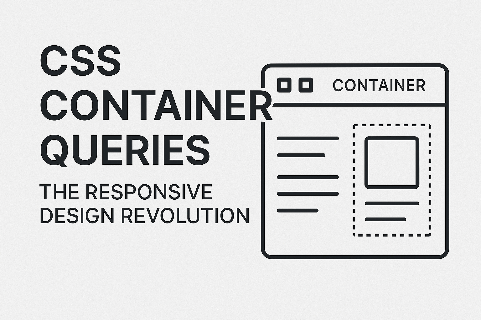
CSS Container Queries have quietly become one of the most revolutionary features in modern web development. Unlike traditional media queries that respond to viewport size, container queries allow elements to adapt based on their parent container's dimensions. This fundamentally changes how we think about responsive design.
Why Container Queries Matter
For years, we've been stuck with viewport-based responsive design. A sidebar component would look the same whether it occupied 300px or 800px of available space. Container queries solve this by letting components become truly modular and context-aware.
Imagine a card component that automatically switches from horizontal to vertical layout based on available space, regardless of screen size. That's the power we're talking about.
Setting Up Container Queries
First, you need to establish a containment context on the parent element:
.card-container {
  container-type: inline-size;
  container-name: card;
}
The container-type property defines what aspects of the container to monitor. inline-size tracks the horizontal dimension, while size tracks both width and height.
Basic Container Query Syntax
Container queries use the @container rule, similar to media queries:
@container card (min-width: 400px) {
  .card {
    display: grid;
    grid-template-columns: 1fr 2fr;
    gap: 1rem;
  }

  .card__image {
    aspect-ratio: 16/9;
  }
}

@container card (max-width: 399px) {
  .card {
    display: flex;
    flex-direction: column;
  }

  .card__image {
    aspect-ratio: 4/3;
  }
}
Real-World Example: Adaptive Navigation
Here's a practical example of a navigation component that adapts to its container:
.nav-container {
  container-type: inline-size;
  container-name: navigation;
}

.nav {
  display: flex;
  justify-content: space-between;
  align-items: center;
}

/* When container is narrow, switch to mobile layout */
@container navigation (max-width: 600px) {
  .nav {
    flex-direction: column;
    gap: 1rem;
  }

  .nav__links {
    display: none; /* Show hamburger menu instead */
  }

  .nav__mobile-toggle {
    display: block;
  }
}

/* When container is wide, use desktop layout */
@container navigation (min-width: 601px) {
  .nav__links {
    display: flex;
    gap: 2rem;
  }

  .nav__mobile-toggle {
    display: none;
  }
}
Advanced Techniques
Multiple Container Queries
You can combine multiple container conditions:
@container (min-width: 400px) and (min-height: 300px) {
  .gallery {
    grid-template-columns: repeat(3, 1fr);
  }
}
Container Query Units
CSS introduces new units that respond to container dimensions:
cqw- 1% of container's widthcqh- 1% of container's heightcqi- 1% of container's inline sizecqb- 1% of container's block sizecqmin- smaller ofcqiandcqbcqmax- larger ofcqiandcqb
.dynamic-text {
  font-size: clamp(1rem, 4cqi, 2rem);
  padding: 2cqi;
}
Browser Support and Fallbacks
Container queries have excellent modern browser support, but you should provide fallbacks:
/* Fallback for older browsers */
.card {
  display: flex;
  flex-direction: column;
}

/* Enhanced layout with container queries */
@supports (container-type: inline-size) {
  .card-container {
    container-type: inline-size;
  }

  @container (min-width: 400px) {
    .card {
      flex-direction: row;
    }
  }
}
Practical Tips
1. Start Small: Begin by converting existing media queries to container queries for specific components.
2. Name Your Containers: Always use container-name for clarity, especially when nesting containers.
3. Consider Performance: Container queries are efficient, but avoid excessive nesting and complex conditions.
4. Think Component-First: Design components that work independently of their surrounding context.
The Future of Responsive Design
Container queries represent a paradigm shift from page-level to component-level responsive design. They enable truly modular CSS where components adapt intelligently to their environment.
This approach makes design systems more robust and reduces the need for component variations. A single card component can now work perfectly in a sidebar, main content area, or grid layout without modification.
Getting Started Today
Container queries are ready for production use in modern browsers. Start experimenting with simple components like cards or navigation elements. The mental shift from viewport-thinking to container-thinking takes time, but the payoff in maintainable, flexible CSS is enormous.
The web is becoming more component-driven, and container queries are the missing piece that makes truly responsive components possible. It's time to embrace this revolution in CSS architecture.